Know the rules The Paceline Forum Builder's Spotlight


Go Back   The Paceline Forum > General Discussion

Reply
 
Thread Tools Display Modes
  #1  
Old 01-23-2019, 07:01 PM
Jmaxwel8 Jmaxwel8 is offline
Senior Member
 
Join Date: Sep 2018
Posts: 291
Opinions on Decals

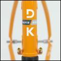
I am working with the painter to touch up my serotta magenta to orange fade. I wanted to get opinions on the decals. The original would have been a decal with a yellow outline. I kind of wanted to do something slightly different so I thought about trying the white outline. I like both really so wanted to get others opinions. Thanks
Attached Images
File Type: jpg serotta logos new-01 (1) copy.jpg (95.8 KB, 284 views)
Reply With Quote
  #2  
Old 01-23-2019, 07:04 PM
OtayBW OtayBW is offline
Senior Member
 
Join Date: Feb 2008
Location: NoBaltoCo
Posts: 6,158
I like it. More contrast and pop to my eye.
__________________
“A bicycle is not a sofa”
-- Dario Pegoretti
Reply With Quote
  #3  
Old 01-23-2019, 07:07 PM
vqdriver's Avatar
vqdriver vqdriver is offline
Senior Member
 
Join Date: May 2008
Location: I don't trust air I can't see
Posts: 6,205
the white outline looks cool. have you tried black outline?

only question with decals is the color match. i'm assuming that's just for illustrative purposes and the decals would be clear over the painted tubes and under clearcoat?
Reply With Quote
  #4  
Old 01-23-2019, 07:22 PM
Jmaxwel8 Jmaxwel8 is offline
Senior Member
 
Join Date: Sep 2018
Posts: 291
For reference. Here are the originals
Attached Images
File Type: jpg decal 2.jpg (110.9 KB, 262 views)
File Type: jpg 45601634375_39c76dde73_z.jpg (129.6 KB, 260 views)
Reply With Quote
  #5  
Old 01-23-2019, 07:29 PM
happycampyer happycampyer is offline
Senior Member
 
Join Date: Jan 2008
Location: Westchester, NY
Posts: 4,365
There's something over-the-top '90's about the tree-frog green with yellow outline set against a neon pink background. Here's a page from the 1992 catalogue:


What's interesting to me is how the green appears to be more yellowish with the yellow outline—I'm pretty sure the green is the same in both examples.

The white outline works, as would black. One thing to consider is how it will look against the orange. Here, I really like the yellow:


In that area, I think a black outline would look better than white.
Reply With Quote
  #6  
Old 01-23-2019, 07:35 PM
Jad Jad is offline
Senior Member
 
Join Date: Dec 2015
Location: NH
Posts: 1,117
Between white outlines and yellow, I like the yellow. It works well with that fade and adds a little zing.
Reply With Quote
  #7  
Old 01-23-2019, 07:59 PM
oliver1850's Avatar
oliver1850 oliver1850 is online now
Senior Member
 
Join Date: May 2010
Location: northern IL
Posts: 9,213
Quote:
Originally Posted by Jad View Post
Between white outlines and yellow, I like the yellow. It works well with that fade and adds a little zing.
Yes, the neon pink and orange alone is kind of blah, needs a bit of zing.

I would stick with the yellow. How much to make me a pair of nhx decals for my top tube?
Attached Images
File Type: jpg mini-2 NHX and windmills.jpg (103.5 KB, 236 views)
Reply With Quote
  #8  
Old 01-23-2019, 08:14 PM
Tony T's Avatar
Tony T Tony T is offline
Senior Member
 
Join Date: Feb 2012
Posts: 6,158
White
Reply With Quote
  #9  
Old 01-23-2019, 08:28 PM
dustyrider dustyrider is offline
Senior Member
 
Join Date: Mar 2012
Posts: 2,998
I like the white. Think it should be yellow cause 90s. But I wonder what the opposite fade color would like as an outline. So pink outline where the paint is orange and orange outline where it’s pink?
Reply With Quote
  #10  
Old 01-23-2019, 08:30 PM
mhespenheide mhespenheide is offline
Senior Member
 
Join Date: Aug 2012
Location: Burien, WA
Posts: 6,044
Everyone has their own opinion, but the tree-frog green of the lettering kills the overall neon-pink-to-orange fade for me. I'd love to see one of those bike with white letters edged by a black stroke.

If you think it's over-the-top 90's fabulous, more power to you.
Reply With Quote
  #11  
Old 01-23-2019, 08:31 PM
weaponsgrade weaponsgrade is offline
Vendor
 
Join Date: Mar 2006
Location: San Francisco
Posts: 2,295
Yellow - The white is a weak attempt to walk-back the loudness. I say embrace it.
Reply With Quote
  #12  
Old 01-24-2019, 07:13 AM
David Tollefson's Avatar
David Tollefson David Tollefson is offline
Senior Member
 
Join Date: Jun 2013
Posts: 1,066
How about trying a silver outline?
Reply With Quote
  #13  
Old 01-24-2019, 08:38 AM
wkeller79 wkeller79 is offline
Senior Member
 
Join Date: Oct 2018
Location: New York, NY
Posts: 254
Yellow!
Reply With Quote
  #14  
Old 01-24-2019, 08:41 AM
Seramount's Avatar
Seramount Seramount is offline
Senior Member
 
Join Date: May 2007
Location: Austin TX
Posts: 2,496
yellow.
Reply With Quote
  #15  
Old 01-24-2019, 11:10 AM
Monsieur Toast's Avatar
Monsieur Toast Monsieur Toast is offline
Senior Member
 
Join Date: Jan 2019
Location: Northern Nev.
Posts: 458
Another vote for yellow.

Signed,
Black lettering with gold outline
Reply With Quote
Reply


Posting Rules
You may not post new threads
You may not post replies
You may not post attachments
You may not edit your posts

BB code is On
Smilies are On
[IMG] code is On
HTML code is Off

Forum Jump


All times are GMT -5. The time now is 04:14 PM.


Powered by vBulletin® Version 3.8.7
Copyright ©2000 - 2024, vBulletin Solutions, Inc.