
|
|
|
#31
 12-27-2019, 08:45 AM
|
|||
|
|||
|
I suggest you go to one of the font sites. Most of them let you put your text in to see what it would look like in each font. Of course, if you're like me, you will never decide

|
|
#32
12-27-2019, 09:06 AM
|
||||
|
||||
|
I suggest you let Alliance do it.
|
|
#33
12-27-2019, 10:11 AM
|
|||
|
|||
|
As a delighted Alliance ti allroad owner, welcome to the club. I was going to point you to Andy STIs, ti allroad with etched graphics, but after reviewing his thread I see you've already been there
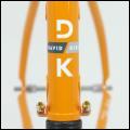
 Are you going polished on Erik's standard finish, or some other combo of matte/brushed/polish/etc? One thing I'd encourage you to carefully consider is that the more complex the font with ligatures etc (FYI, during my undergrad major in journalism we actually hand set lead type from cases as a learning experience about leading, kerning etc) the more distinct the color differences need to be to be legible. For ti-on-ti graphics I'd be careful not to get too much detail which may end up being indistinct. In terms of font, I agree that Erik is among the minority of framebuilders who have multiple font options, although Steve has at least two options for Hampstens, and over the years I've seen several different approaches to Dave Kirk's logos as well. I've had three custom frames over my riding time, and with each I stayed with the builder's standards as I felt I was buying their brand/image. Two of the three were ti, and the first two were brushed with builder-standard logos as that was the primary aesthetic of the builder. When working with Steve I originally had some wild-ass ideas for paint, but after a few conversations it was clear he had an aesthetic in mind for his bikes and wasn't enthused about my ideas. I agreed with him -- not just to get along, but because after thinking about it, he was the brand and I was buying the whole thing -- design, fabrication, finish. I did, however, keep seeing ti bikes with some paint that just made me drool -- Spectrum, DeSalvo, Serotta to name a few. (Did I mention Spectrums, Spectrums and Spectrums??? ) So when I decided to work with Erik we kicked around some ideas and when I heard him excited about the look I felt like we were on to something. And I felt that his script logo worked well with the look we wanted.All that is to say "trust the builder." You've already worked with Erik on frame design so you know how good he is. If you're going with Erik's go-to guy Ollie at Dark Matter you're in great hands too. Bottom line, it is your bike -- and Erik's too. You can see from Andy STI's bike that his script font looks great ti-on-ti. If you really feel you need bespoke logos in addition to a bespoke bike to make a statement, go for it. What you don't want is a version of buyer's remorse where you look at a font a non-graphics person has chosen and find the execution wasn't quite what you had hoped for. Get Ollie's point of view as well as Erik's as you move forward. And ride the heck out of it -- exciting to be getting a great frame from a great guy! Last edited by teleguy57; 12-27-2019 at 10:26 AM.
|
|
#34
12-27-2019, 10:51 AM
|
|||
|
|||
|
Quote:
Wow. Great post. So much to respond to here. 1) I became a personal trainer after going to "J-School." What did you do with your journalism degree? 2) Oh, yes. I've seen AndySti's bike(s). Many times. He's my "Paceline Influencer." Practically bankrupted me. Note to AndySti: if you get a tandem, I'm officially "blocking" you. 3) Erik has the patience of Job. I vacillated many times about the actual build I wanted, and he was always very even keeled and patient. But, after seeing that DeSalvo bike a few years back (it was actually listed for sale here about three years ago), I became really enamored with that type of font. It may, as you suggest, be very subtle on a Ti frame. So much the better, for me. When it comes to Ti, I like raw metal with muted graphics. 4) Great suggestion about Ollie. I'm sure he can offer his input. 5) Interesting comment about bike ownership vis-à-vis being a mutual project between Erik and myself. I don't think he had any problem with the bespoke stuff. With the caveat that I would be paying for it... The panels will be "blasted cubic zirconia" which creates a rougher look, and have brushed logos. I think it will look really cool. Toss in Erik's anodized head badge, (similar to Andy's) and I'm riding some serious eye candy. As an addendum, I did ask Erik if my bike would ride as fast as Andy's, and he had no official comment
|
|
#35
12-27-2019, 01:30 PM
|
|||
|
|||
|
I like script looking blasted/laser/etched stuff on raw ti.
 I am going to get something similar soon myself. brushed over raw. it might just say "yeah" and "dude" on either side of the downtube, which would be ridiculous but awesome. I have had success just finding fonts in google docs and microsoft. To wit, my Serotta has an open source font from google docs; I just made it bold and italicized to get the look I wanted:  IMG_20180719_082345627 by z937, on Flickr IMG_20180719_082345627 by z937, on Flickr
|
|
#36
12-27-2019, 05:25 PM
|
|||
|
|||
|
Quote:
IMO a couple of very valid points. I don’t like the concept of ‘buying into a brand’ but in the same breath realise that by tweaking the Alliance brand logo type you’re actually cheapening the brand itself (said without meaning to offend).
|
|
#38
12-27-2019, 05:40 PM
|
|||
|
|||
|
Doug's advice is good because when a font wraps a tube it can definitely change the look of it.
But I'm a font snob. It must be from having had four girlfriends who are professional graphic designers (and one who taught typography at a top art school). It's to the point where I wouldn't buy certain great bikes because I hate the font chosen by the builders who, while very talented with a torch, should leave the graphic design to the pros. Hell, they wouldn't want a bike welded by a graphic designer.
__________________
I'm riding to promote awareness of my riding Last edited by avalonracing; 12-28-2019 at 08:17 AM.
|
|
#39
12-27-2019, 05:54 PM
|
|||
|
|||
|
Quote:
|
|
#40
12-27-2019, 05:57 PM
|
|||
|
|||
|
Quote:
|
|
#41
12-27-2019, 06:51 PM
|
|||
|
|||
|
Quote:
|
 |
|
|


 Linear Mode

