

|
|
|
#19
 01-15-2019, 08:19 AM
|
|||
|
|||
|
The Canyon, Ridley, and Giant are pretty good if not a little boring. The Merckx and the Cervelo are especially bad. The rest are meh. They are all look basically the same. That's what happens when you have design optimized by wind tunnel testing.

|
|
#20
01-15-2019, 08:45 AM
|
|||
|
|||
|
Some of these bikes suffer from photography with a noisy background, and a photo angle that makes setups and dimensions look somewhat awkward.
The Specialized Venge looks great, as do the Trek bikes - wish there were better pictures of the Trek. BMC, Canyon, and Argon 18 also look like clean, modern classics. I want to like integrated bar/stems, against my better judgement, but a lot of the ones on those bikes look wrong - particularly the Deda one, which ruins the Ridley for me. The Cannondale looks particularly awkward with the standard stem and bar - as do most bikes designed for integrated, stem-routed cables. Nice to have the option, but it doesn't look great.
|
|
#21
01-15-2019, 09:14 AM
|
||||
|
||||
|
Since everybody has disc brake groups, surprised there are any who don't have them...

__________________
Chisholm's Custom Wheels Qui Si Parla Campagnolo
|
|
#23
01-15-2019, 09:55 AM
|
|||
|
|||
|
I would love to ride any of these around the block. Wonder if some of them feel as screwed up to ride as they look...
That Ridley is the best classic look. The Merckx looks almost disjointed, but in a mean, racy way. The seat stays and hunched TT do that partly, I think. The C'dale shows how much font can interrupt. The bike looks bad to me anyway, but the stolid font bums the entire bike out more.
|
|
#24
01-15-2019, 10:38 AM
|
|||
|
|||
|
Quote:
Quote:
|
|
#26
01-15-2019, 10:52 AM
|
|||
|
|||
|
Quote:
Teams on disc brakes only: 4 Teams on a combination of disc and rim brakes: 4 Teams on rim brakes only: 10 It seems the pelOton (spelling for the benefit of oldpotatoe) is not switching to disc brakes as fast as some predicted.
|
|
#27
01-15-2019, 11:09 AM
|
|||
|
|||
|
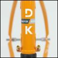
The Cannondale typeface is a callback to the old train station logo. It also isn't that different (to my untrained eye) than the Gaulzetti typeface that everyone seems to be fawning over. It fits the minimal aesthetic of the EF team in general.
Personally I like it compared to all the swoopy slanted too-big typefaces on all the other bikes. I also find "all the bikes look the same" to be an odd criticism. When everything was skinny steel tubes and downtube shifters, it looked the same. Modern carbon has a remarkable variety of tube shapes, bends, curves. Last edited by Jaybee; 01-15-2019 at 11:13 AM.
|
|
#28
01-15-2019, 11:18 AM
|
||||
|
||||
|
Quote:
|
|
#30
01-15-2019, 12:51 PM
|
|||
|
|||
|
The future of road bike design looks bleak.
Fat head tubes are fugly. Swoopy-loopy frame tubes are fugly.
|
 |
|
|


 Linear Mode

