

 |
 |
 |
|
#1
|
||||
|
||||
|
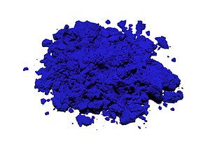
A new blue pigment--no, seriously--discovered by chemists
I love this color, and love that it was an accidental discovery.
Meet YInMn! (i'd love a frame in this color! https://hyperallergic.com/615971/mee...two-centuries/ Last edited by paredown; 01-27-2021 at 08:42 AM. |
|
#2
|
||||
|
||||
|
Reminds me of Yves Klein blue, beautiful
__________________
please don't take anything I say personally, I am an idiot. |
|
#3
|
|||
|
|||
|
Beautiful shade of blue.
That being said, this doesn't look that new to me - it looks just like the Majorelle Gardens (lived in by Yves Saint Laurent, per BT's reply). https://www.google.com/url?sa=i&url=...AAAAAdAAAAABAE I actually bought paint that was this same matte blue and painted a lot of furniture at my place in a prior house (this one - https://www.bristolpaint.com/majorelle-blue-ultramarine). It looked very nice in the right context. It was somehow both vibrant and calming at the same time. |
|
#4
|
|||
|
|||
|
One of you techno-savvy folks can please explain how there is a new color - I would have thought colors exist on a continuum or similar.
|
|
#5
|
|||
|
|||
|
It is a new pigment - a chemical compound that is a specific color. Pigments are used in the paint mixers you see in Home Depot and hardware stores - and there aren't that many of them - Titanium white, Lead oxide yellow etc. A new deep blue pigment opens up lots of possibilities for deeper, richer colors.
Blue colors have always been difficult, there just aren't that many things that are naturally blue - so this is a big deal in the paint, plastic, textile, printing businesses. |
|
#6
|
||||
|
||||
|
Yes, colors exist on a continuum as light, think rainbow, but creating physical colors requires chemicals, materials, binders, etc. Same, but different.
The photo of the new color is amazing too. It has a wonderful 3D property to it, even with my almost 5 YO phone. |
|
#7
|
||||
|
||||
|
Quote:
it's replicating it in a form people can use that makes it new. |
|
#8
|
||||
|
||||
|
Quote:
(Changed title of original post to pigment.) Last edited by paredown; 01-27-2021 at 08:45 AM. |
|
#9
|
|||
|
|||
|
Light exists on a spectrum, but pigments don't. Mixing pigments can give an illusion of a spectrum of colors, but individual pigments are a single color. (An example of mixing colors to give an illusion of colors is the video display you are looking at right now. The video display may look like it has a "pallette" of thousands of colors, but in fact it only has 3 - red, green and blue. But when mix them in different intensities, the human eye perceives it as different colors)
This color of this new pigment looks like it is just a slight variation of the color of existing pigments. In fact, it looks a lot like ultramarine, which has been around for centuries. Ultramarine:  YInMn: 
|
|
#10
|
|||
|
|||
|
That is pretty cool and a beautiful color
|
|
#11
|
||||
|
||||
|
Both you and Mark McM are onto something--the long Wiki article on ultramarine, mentions Yves Kein's use of ultramarine, which as Mark points out is close in color to this new pigment. And thanks for the link to Majorelle Gardens--did not know about this.
Years ago I did a large ceramic floor for the office area of my dad's shop in a lovely cobalt blue Italian tile--also in this color family--and I loved the effect. (The tile was a major bargain because it was too bold for most people,) The article makes clear though this pigment is chemically stable and resistant to light and other things that cause pigments to degrade (unlike ultramarine)--and they are working at new pigments as well. Last edited by paredown; 01-27-2021 at 08:54 AM. |
|
#12
|
|||
|
|||
|
Thanks all, now I get it!
|
|
#13
|
||||
|
||||
|
This is pretty close to my favorite--the color of chicory growing wild on the side of the road. Riding along and taking in the these flowers is part of the sort of nature bath I experience riding. If I meditate when I am exhausted or otherwise cooked, moving through the colors of the Roy G Biv sequence of cues--the rainbow--it's fields of chicory flowers that I picture in my mind for the color blue.
|
|
#14
|
|||
|
|||
|
Let's all be clear it's very possible none of us are seeing what this color actually looks like.
They're not calling it out in the article but considering how saturated it looks it could very well be something that's outside the gamut of our monitors or the digital cameras, or weird enough the color correction in our computers can't quite deal with it. I have my screen calibrated and yet am not really under any illusions it's showing the pictures of this color or the Ultramarine used as a comparison accurately. Silly joke: They painted a Telecaster with hit.. no one would ever buy that since the color didn't exist in the 1950s.  If you are into photography and/or printing you will come across lots and lots of stuff in real life that you take for granted that is incredibly difficult to accurately show on your prints or your screen. Flowers for example. I have had several printers capable of printing color ranges that can't display on the screen.. that stuff is pretty weird to deal with. edit: Other sources say this pigment extends into the near infrared.. another very likely indicator we might see it different in person than on the computer. Digital cameras have filters to try and filter that out.. it's a real gray area in terms of getting things just right. Last edited by benb; 01-27-2021 at 10:29 AM. |
|
#15
|
||||
|
||||
|
Quote:
 (I was never in the biz, but had a bunch of friends who were. And my wife indirectly when she was working with fashion.) And yes--calibration of screen to printer is beyond my capabilities--I've never had to do that. (I was never in the biz, but had a bunch of friends who were. And my wife indirectly when she was working with fashion.) And yes--calibration of screen to printer is beyond my capabilities--I've never had to do that.A great long while ago, I worked for NORCO Bike (out of Vancouver)--and they were one of the first (in Canada at least) to do a full set of blister-pack bike accessories--kind of a new thing, self serve instead of everything behind the counter. So it was the usual--the early version of planogram for the fixtures, matching order sheets, counts--X number of item Y on each peg, standard pack count for the boxes where possible. But the hardest thing in those days was to get the manufacturers to print the backing cards in the right color and the right saturation--the theme then was red and blue on a white backer. Frantic Telexes went back and forth, samples were sent--and still--stuff would show up--not quite the right color, not quite the right saturation--and it would drive us crazy. You'd lay out your 8' fixture for Hudson's Bay and instead of consistency, you'd see variation... Now it seems the universal language of Pantone has conquered the world--when I have helped my lovely wife with displays, I'm amazed at how consistently manufacturers can now print packaging to spec... Last edited by paredown; 01-27-2021 at 10:36 AM. |
 |
|
|