
|
|
|
#16
 03-28-2019, 02:25 PM
|
|||
|
|||
|
That grey one is nice!
 I prefer the new logos and have really enjoyed this color, it is pretty subdued and looks great with black tape and dura ace 9100 I prefer the new logos and have really enjoyed this color, it is pretty subdued and looks great with black tape and dura ace 9100

|
|
#17
03-28-2019, 02:29 PM
|
|||
|
|||
|
dark metallic grey
the dark metallic grey on this Cherubim is really nice...goes well with black as well as most any secondary colors (blue, pink, red etc) if you considering a colored headset, hubset etc...
Personally, I think silver (the primary color on the Cherubim) doesn't look good on bike frames
|
|
#18
03-28-2019, 02:33 PM
|
||||
|
||||
|
Quote:
|
|
#24
03-28-2019, 04:27 PM
|
|||
|
|||
|
Quote:
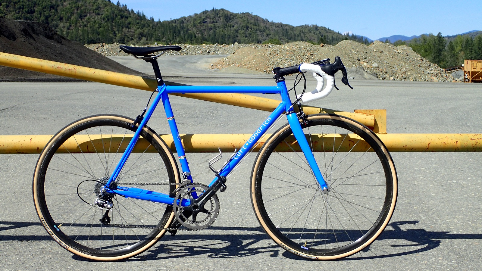
He used that color for his team cross bikes. Don't remember how many seasons, but I still see one of them around here in MSP.
|
|
#27
03-28-2019, 05:54 PM
|
||||
|
||||
|
Quote:
 Another great color for a bike. Makes my love of blue bikes seem so pedestrian. Another great color for a bike. Makes my love of blue bikes seem so pedestrian.
__________________
And we have just one world, But we live in different ones
|
|
#28
03-28-2019, 06:08 PM
|
||||
|
||||
|
Quote:
__________________
***IG: mttamgrams***
|
 |
|
|


 Linear Mode

