Quote:
Originally Posted by marciero

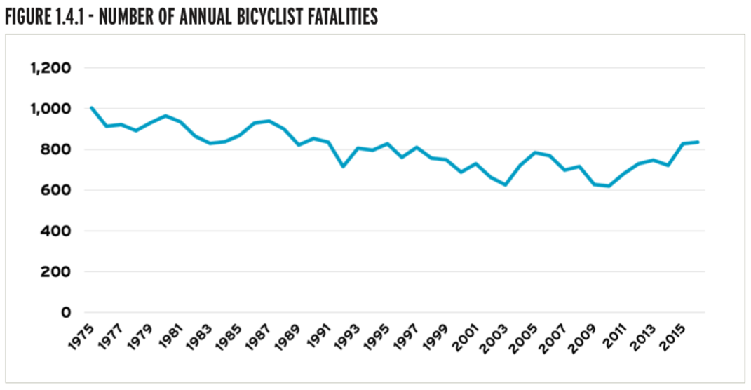
These very fatality numbers were discussed at length in a recent thread as I recall. Using raw fatality numbers to draw conclusions can be very misleading. The "safety in numbers" graph in the article-there is way too much variation to draw any conclusions. Even visual inspection of the fatalities graph seems to indicate decreasing or flat fatality rates with significant variability. That said, the numbers for individual cities is of interest. The actual report (I actually downloaded it) seems to have a lot of this kind of thing which is of interest, but nothing to draw sweeping overall conclusions with.
|
Yes, exactly. Numbers and rates tell us very different things. Both are important, but on their own can be misleading since rising numbers can still mean a declining rate, if the underlying population (number of people cycling to work, for example) changes in the same period.
The linked article shows the below chart. You can see that over time, there's been a general downward trend, although sometimes it takes two steps forward and one step back - this is normal. The article notes that "since 2007... there's been a 50 percent rise in the rate of people biking to work." And from eyeballing that chart, there's only been a ~10% rise in fatalities over the same period of time. 50% more people, but only 10% more fatalities? Though every fatality is a tragedy, that's still encouraging.