Quote:
Originally Posted by bloody sunday

you're always going to "look" like something else. they're objects, who cares if the badge looks like ff's. guess what? all bikes look similar
|
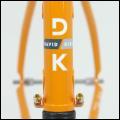
Couple reasons from my mkting centric brain these days. 1) This is a brand trying to start from scratch and disassociate itself from a rather contentious recent history. For that reason alone, I like some of the new logo work. It's more modern and a distinct departure from the Serotta scripts.
However, 2) This is one boutique builder in the Northeast specializing in mostly TI bikes whose branding now looks similar to another boutique builder in the Northeast who specializes in TI bikes. This isn't all that different from the problem post-war bike manufacturers faced when tube shape, lugs, etc, made it impossible to tell the difference by eyesight. Bianchi adopted that celeste color. Cinelli has that flying logo. And a Colnago isn't a Colnago without that clover somewhere on the bike.
My point is that for a brand starting from scratch, essentially, it's imperative they have a clean break from the past and -- more importantly -- have a unique voice in the marketplace. If you can look at the logo and your first thought it "Hey, they remind me of X, or Y or Z" competitor, then it's a mis-step, plain and simple. They needed something that isn't a distillation of all the design queues their competitors are using or the trends of the moment, but something uniquely theirs.
Quote:
Originally Posted by jpw
Moving along, opinions about the models?
|
Branding aside, I think they've done a great job with the models. They seem to be hitting all the sweet spots. The big question, of course, will be pricing.

 10-07-2013, 11:01 AM


 Hybrid Mode
