
|
|
|
#121
 12-14-2023, 09:08 AM
|
|||
|
|||
|
1750 isn't that bad!
So somewhere between a lightweight Al frame and normal steel frame. Afaik, the strael frame is like 2kg, if not more, plus the weight of the fork. 
|
|
#122
12-14-2023, 09:51 AM
|
|||
|
|||
|
Quote:
Whom is FTW? Did I miss something earlier in the thread?
|
|
#123
12-14-2023, 09:53 AM
|
||||
|
||||
|
Quote:
https://www.frankthewelder.com/
__________________
http://less-than-epic.blogspot.com/
|
|
#124
12-14-2023, 10:24 AM
|
|||
|
|||
|
Quote:
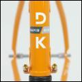
More good news: The somewhat-garish new graphics are easily removeable. So, if you received a frame with some questionable new decals added on top of the classy and simple "Duetti" Graphics, hit it with a hair dryer and the stickers will scrape off pretty easy with an old credit card. Some alcohol will remove any sticker residue left behind. The original "Duetti" graphics will remain intact, since they are actually under the clearcoat. I don't know what they were thinking with those stickers, but the forum member I purchased my frameset from spoke with Ben directly and said he was trying to add some more brand recognition with the new graphics. This isn't a good way to do it! The frameset is really nicely painted and finished, so tacked-on decals are silly. I could see the original "D" logo coming through the "S" sticker that was placed on top - absurd! Original paintwork: https://www.theproscloset.com/cdn/sh...g?v=1678914585 New stickers: https://serotta.com/wp-content/uploa...e-1024x653.jpg Comes right off: Last edited by TrackSmart; 12-14-2023 at 10:27 AM.
|
|
#125
12-14-2023, 10:36 AM
|
|||
|
|||
|
Dammit. Now I kinda want one of these ferreallll!
|
|
#126
12-14-2023, 10:57 AM
|
||||
|
||||
|
Quote:
Wow that sticker takes afterthought to another level. What a terrible solution. Glad it is easily removed.
|
|
#127
12-14-2023, 11:39 AM
|
|||
|
|||
|
Quote:
|
|
#128
12-14-2023, 12:08 PM
|
|||
|
|||
|
Quote:
|
|
#129
12-14-2023, 12:28 PM
|
|||
|
|||
|
Quote:
|
|
#130
12-14-2023, 12:44 PM
|
|||
|
|||
|
Quote:
__________________
Instagram - DannAdore Bicycles
|
|
#131
12-14-2023, 01:02 PM
|
||||
|
||||
|
Quote:
I admittedly do not know the intricacies of what he did or didnt have rights to when it came to branding but why would it be OK to have the name plastered on the downtube, but not OK to have a letter 'S' on the headtube? If one was legal but not the other, that would be odd. I assumed 'Duetti' was a sub-brand that allowed Serotta to reach markets it otherwise wouldnt touch. Something like that. Acura/Honda as an easy comparison.
|
|
#132
12-14-2023, 01:29 PM
|
|||
|
|||
|
Quote:
https://forums.thepaceline.net/showthread.php?p=3209125 
__________________
Instagram - DannAdore Bicycles
|
|
#133
12-14-2023, 01:30 PM
|
|||
|
|||
|
Quote:
|
|
#134
12-14-2023, 01:41 PM
|
|||
|
|||
|
Quote:
|
|
#135
12-14-2023, 02:59 PM
|
|||
|
|||
|
Quote:
Quote:
Original paintwork: https://www.theproscloset.com/cdn/sh...g?v=1678914585 New stickers *added on top* of the original paintwork: https://serotta.com/wp-content/uploa...e-1024x653.jpg Notice how the original does not have giant "Serotta" stickers on the side or a giant orange/gray "S" sticker on the headtube. That "S" sticker still allowed the "D" for Duetti logo to be seen underneath, which looked terrible. The big "Serotta" logo stickers were okay, in terms of look, but I personally prefer the simplicity of the original paint job. The reason the frameset didn't say "Serotta" in big letters originally is that Ben Serotta didn't own the Serotta brand at the time he designed them. The company did. So, instead of "Serotta" in giant letters, the frame had small "Serotta Design" logos and a much more subtle "D" (for Duetti) on the head tube. I'm guessing he was leery of being sued. Here's a photo from ltwtsculler91's build, below. It just looks way more tasteful without the tacked-on graphics. Again, the giant logo looked fine (though a bit strong on the branding), but the headtube sticker was just cheesy and terrible. Last edited by TrackSmart; 12-14-2023 at 03:22 PM. Reason: EDIT: Fixed photo links.
|
 |
|
|


 Linear Mode

